Digital accessibility is a hot topic at the moment. The buzz is getting louder and louder: the web must be accessible to everyone, including people with challenges. But why is digital accessibility so important? And above all: why is it important for your organization? We have listed 9 reasons for making the web accessible to everyone.
The internet has become an essential part of our lives. We find information, go shopping and arrange important things. However, the internet is often a maze for people with challenges. On websites that are not accessible, they have trouble finding, reading and understanding the content. As a result, they sometimes cannot participate fully. By making your website accessible, you avoid excluding people.
If you think the number of people with challenges is small, then you are wrong. More than 4.5 million Dutch people have difficulty reading and understanding websites. That is 25%! This includes not only blind and partially sighted people, but also people with dyslexia, motor challenges, immigrants, low-literate persons and an ever-increasing group of older people. In addition, everyone can also get a temporary limitation. For example, someone who has undergone cataract surgery may have equally poor vision and someone who breaks his wrist may have to temporarily mouse with the left. With an accessible website you help a lot of people.
The amount of elderly in the Netherlands is growing, they have a lot to spend on average and they are increasingly online. So this is a group to take into account. The internet is not always easy to use for them. They are often visually challenged and less likely to pick up new things. Organizations with inaccessible websites miss out on opportunities here. We also have a social responsibility towards this group. Digital exclusion lurks especially for elderly people who live alone, because they are less likely to ask for help from others.
Chances are that a significant part of your target group also has a challenge. Is your website accessible? Then they will experience fewer barriers and are more likely to buy from you. Especially if the website of your competitor is not accessible. So you should treat making your website accessible more as an investment than as an expense. In the end, it can actually stimulate your sales.
If people with challenges can easily use your website, they will be less likely to ask your customer service for help. Making your website accessible can therefore save you a lot of time. Especially if a large part of your target group now has trouble visiting your website.
By optimizing your website for accessibility, you often kill two birds with one stone. The correct formatting of headings, the use of alt tags, a good structure of the code, clear navigation … all these optimizations also help search engines read and understand your content. This allows you to achieve higher rankings. Did you want to start with your SEO anyway? Then you can merge these projects nicely.
Many improvements you make for people with challenges make it easier for people without challenges. They also benefit, for example, from good navigation options and text that can be easily enlarged. In addition, accessibility optimizations often make your website faster.
As of September 23, 2020, the websites of government and semi-government agencies must comply with the guidelines of the WCAG 2.1. New websites already need to comply with these rules since September 2019. More stringent legislation on accessibility is also being introduced for commercial companies. So if you don’t do it for your users or for your own wallet, the government will eventually enforce it.
Inclusivity and diversity are topics that are being talked about progressively and that people value increasingly. Many brands have already successfully responded to this. More and more often people with different body types, religions, skin colors, ages, sexuality and limitations are playing a role in marketing expressions. With an accessible website you can respond to this movement and strengthen your brand.
We hope that after reading this article you are also convinced of the importance of digital accessibility. Do you want to make your website more accessible? With Aally you can make your website usable for people with a challenge within a short time. We are happy to tell you more!
Do you use social media a lot for business? Or does your company use social media for its contacts with customers and potential users? Then you may wonder how accessible these channels actually are for people with a challenge. Because although Dutch law requires (semi-) government institutions to make their websites and apps accessible according to WCAG guidelines, social media are excluded. And that is quite strange. Because why would you leave the part of the website that you use to contact your user outside the scope? That’s why we offer you a number of suggestions to improve the accessibility of your social media channels!
First of all, check the information of the social media platforms themselves. Although they do not automatically have to comply with accessibility guidelines, they are busy improving their services. Various platforms are now working hard to make the use of their channels more accessible.
If you want to get started with making your social media channels more accessible, it is useful to stay informed of the developments in those different media:
That of course sounds a bit like a slam dunk. A clear text does not only help people with challenges to better understand what you mean. But before you send your message out into the world, it might be useful to read through the following suggestions.
They often look nice and you probably use them to make your message stand out. Screen readers, however, simply read aloud these types of symbols. So people hear “smiling face with open mouth and closed eyes” or “colon closed parenthesis”. You can imagine that a frequent use of these symbols in your message leads to unclear spoken text for those using assistive technology. Before using an emoji, it is wise to take a look at how this symbol translates into text.
When using a multi-word hashtag, such as #SocialMedia or #VirtualReality, make sure that the single words are separated by a capital letter, called CamelCase. A screen reader recognizes the individual words more easily and there is no confusion with the pronunciation. #Blacklivesmatter is pronounced “black live smatter” by a screen reader.
In any case, make sure to include hashtags and @ mentions at the end of your message. Since screen readers read all punctuation marks, your message will be messy and unclear.
People who cannot see or have difficulty seeing an image depend on descriptive or alternative text (Alt text) to understand what is happening in an image. Missing or incorrectly displaying alt text on an image is still the most common problem with inaccessible content according to WebAIM.
The various social media offer options to add alt text to images:
Some suggestions for when you write an alt text:
A screen reader knows that there is an image and also announces this during the reading. If you start an alt text with “image of” or “picture of”, it will be spoken twice.
It is not enough to add an image to an article about the collapse of the stock market with the alt text “chart with the development of the daily share prices”. It is more understandable to add an alt text like: “line graph of the daily share prices of the AEX, which was still at 600 points this morning at 9:00 am and at 530 points this afternoon at 4:00 pm.”
Color can sometimes give extra meaning to what can be seen. So not “Beautiful sunset” but “Beautiful sunset makes the sky purple, pink, orange …”
Many GIFs have no description. Twitter offers the option to add alt text to a GIF. When a social media platform does not offer the possibility to describe GIFs via alt text, at least describe them yourself in an accompanying text.
Adding a subtitle to a spoken text makes the video accessible not only to people who are deaf or partially hearing. It also helps non-native speakers to follow a video better. Or children learning to read. Or people who want to watch the video message in an environment where no sound is desired or where it is very noisy. Research shows that people remember the content of a video message better when it is subtitled.
With the various social media platforms you can add subtitles to your video as follows:
Do you have an inaccessible website or do you need help making your website more usable? We can help you! Do you want to know more? Please contact us.
When companies get started with web accessibility, one thing is quickly forgotten: making documents accessible. About 25% of the world’s population lives with some form of challenge. How unfortunate if they can’t open, read or understand your text documents, spreadsheets, PDFs and presentations? Moreover, there is now legislation that says that online documents from (semi-) government institutions must be accessible to everyone. This type of legislation will become valid for other organizations in the years to come.
A document is considered accessible if it meets the criteria of WCAG 2.1 (Web Content Accessibility Guidelines). People with challenges ,blind and partially sighted people for example, should then be able to use it. We recommend that you take accessibility into account while writing or creating a document. That is much easier than if you have to make a document accessible afterwards.
You should pay attention to this, among other things:
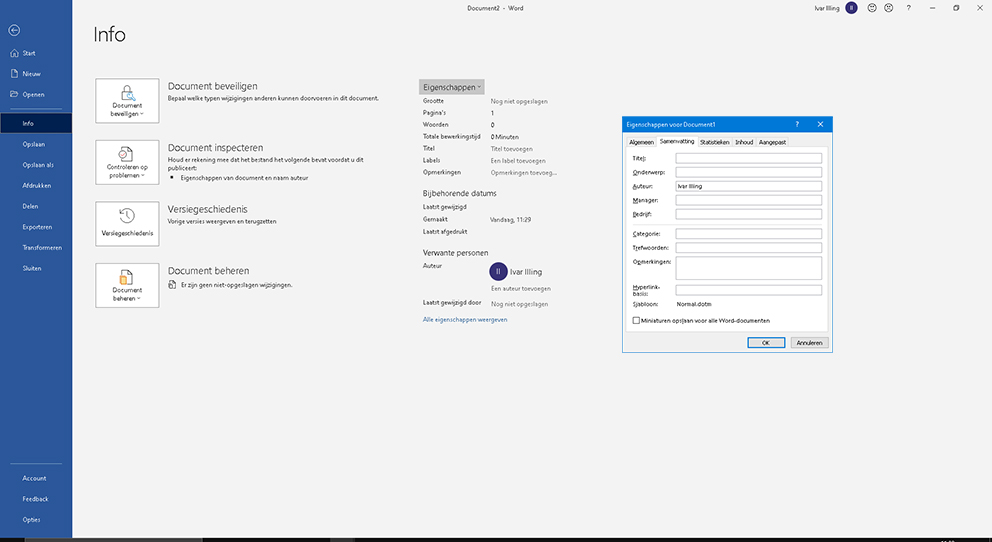
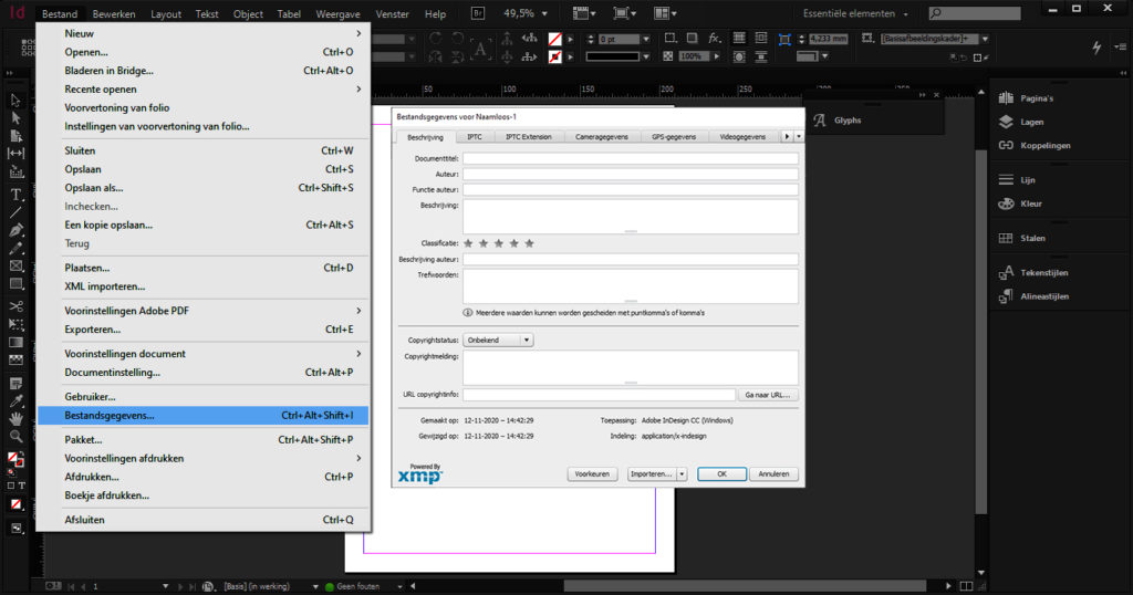
The creator of a document can add information in the document properties. Consider the title, author, language and subject of the document. This information helps readers with challenges. They can then find the document more easily and understand more quickly what the document is about. You can also use keywords here, so that the document will come up sooner in search engines such as Google.
In Word:

For InDesign:
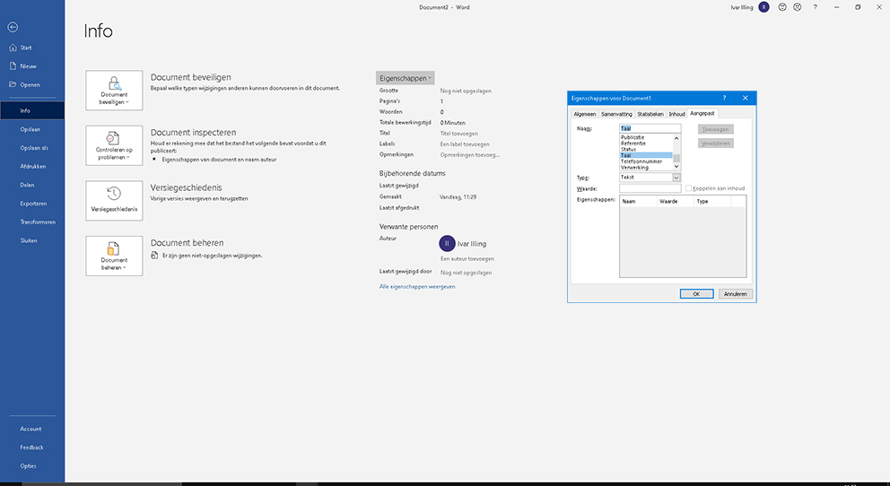
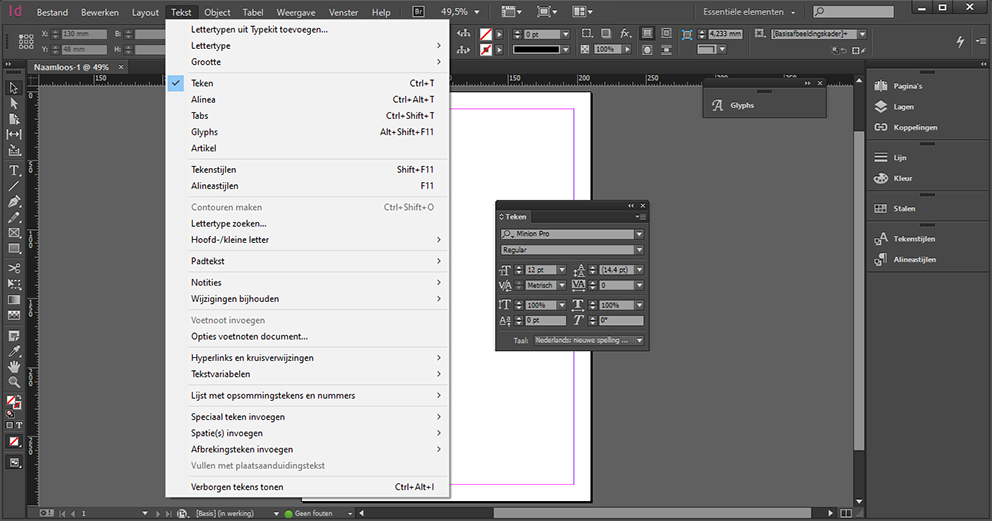
It is important that you specify the correct document language. This allows screen readers to read the text in the correct language.
In Word:
For InDesign:
Images and interactive form fields must be provided with a description or alternative text. This way, users of screen readers also understand what can be seen in an image or what a form field is for.
In Word:
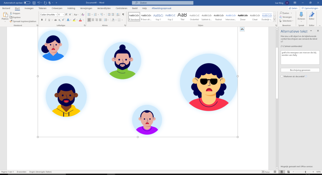
A nice overview of how you can do this in different versions of Word can be found on this link from Microsoft.
For InDesign:
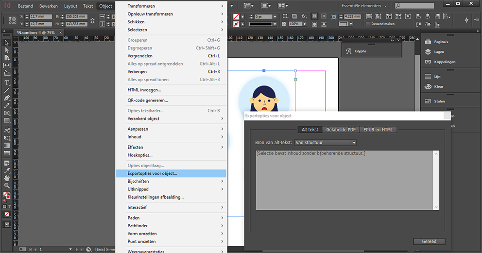
The structure of your document is very important for users who navigate with a keyboard or use a screen reader. They jump from element to element. By means of styles and codes you can indicate in your document what kind of element it is, so that screen readers can recognize it. Think of headings, sections, paragraphs, bulleted lists, and tables. For example, it is important that headings are formatted as headings (h1, h2, h3, etc.) and that lists are formatted as bulleted lists.
Does a user have your document read by a screen reader? Then it is nice if your document is also read in the correct order. This sometimes goes wrong. Your heading structure is good if you let your word processor generate a table of contents and your table of contents matches your intended document structure.
The WCAG 2.1 guidelines help you make your documents accessible and usable. Also for users with disabilities. Do you need help making your documents accessible? We are happy to help you through our document service. Knowing more? Please contact us.
This is a republication of the article we wrote earlier for Frankwatching.
This is part 5 of our blog series on testing the accessibility of your website. Also read the other parts:
Color and contrast
Enlarge font
Keyboard navigation
Automatic testing
Do you want to get started with the accessibility of your website? Then it helps to test how your website is doing now. You learn a lot from that, so that you can then take more targeted measures. This is part 5 of our blog series on testing the accessibility of your website.
In this section, we’ll take a closer look at testing with a screen reader. The screen reader is a widely used tool, especially for blind and partially sighted people.
A screen reader reads the HTML structure and content of a web page from top to bottom. It then converts this into text, reads it out and, if necessary, forwards it to a Braille display. Especially people who are blind or partially sighted use it. Sometimes people who have trouble reading (for example because they suffer from dyslexia) also use a screen reader. Interestingly, almost 11% of screen reader users are not challenged. They have articles read aloud, for example.
For blind and partially sighted people, however, a screen reader does much more than read articles aloud. They also use the screen reader for communication, navigation, requesting services and buying products. It is an essential tool for many of them to access the digital world.
Did you know that blind and visually challenged people can even use platforms such as Instagram with the help of a screen reader? This is made possible by image recognition technology, manually added alt text and audio descriptions.
Screen reader users experience your website in a very different way than sighted users:
As a sighted user you see a website in blocks of information. Most web pages have navigation features at the top or side of the page. Images are used to direct your attention to the most important information, for example to new content or offers. A well-designed website uses visual cues to help you understand and use them.
Screen reader users read a website linearly, from top left to bottom right. They have no overview and cannot oversee the entire web page. The entire page is read aloud in text as a marquee. As a result, the visual layout and the position of the information is no longer important.
With a screen reader you read a website line by line, item by item. To quickly browse through a page, you can use the search function on the site or in the screen reader. You can also jump from element to element. For example from link to link, header to header or form field to form field. The structure is determined by the source code of the page and the corresponding text is read aloud. It is therefore very important for screen reader users that the structure of the page is properly set up. You can quickly see whether the structure is in order by pasting the text of a page without format and images into a text editor.
The following screen readers are the most popular:
Screen readers are usually developed specifically for a particular operating system. As a result, people often use multiple screen readers.
JAWS for Windows is one of the best-known screen readers, but also the most expensive. It costs more than € 1000. NVDA and Microsoft’s built-in “Narrator” screen reader are free alternatives to Windows. Apple VoiceOver comes with any Mac or iOS device. On Android you can use TalkBack and for Chrome there is ChromeVox. You can test your website perfectly with these free options.
Although testing with as many screen readers as possible would be preferable, it is generally recommended to test with 1 or 2 screen readers.
If you are going to test, check whether your website meets the following points:
Testing with a screen reader can be quite a challenge if you have never worked with a screen reader before. So don’t jump to conclusions if something doesn’t work out but first find out if you might be doing something wrong yourself.
You can of course also leave testing the accessibility of your website with a screen reader to users with a challenge. We even strongly recommend it, because they should be able to use your website in the end. Are you not sure how to approach this? We are happy to help you with this. First we can put together a user group consisting of both experienced and less experienced users and let them test the website with a screen reader. We then convert the results of this test into advice. We can also conduct an expert review for you. One of our accessibility experts will then check your website for, among other things, the points that we have described above.
Need help testing the accessibility of your website? We are happy to help you! Please contact us.
Many organizations do their utmost to meet accessibility standards (such as the WCAG). But can people with a challenge really use the website? Meeting accessibility standards is no guarantee for this. That is why we believe it is essential to conduct user tests with experts by experience. Moreover, users with challenges are ideal advisers when it comes to user-friendliness. They expose problems like no other. Thus involve experts by experience in your user tests to obtain a real accessible website! But how do you approach those user tests?
It is smart to involve users with challenges early on in the development process. You can do that, for example, by including them in use cases, user analysis, personas, scenarios, workflows and design walkthroughs. Many organizations put together a team of experts for this purpose.
This has several advantages:
Not everyone is the same. This applies just as much to people with challenges as to people without challenges. Everyone has their own experiences, expectations and preferences. In addition, people with challenges each use different interaction techniques, adaptive strategies and supporting technical aids.
Complexity is not limited to the category of challenge (auditory, cognitive, visual, physical, etc.). There are also people with multiple challenges and extreme variations can be found within each category. For example, a visual challenge includes people who have been completely blind since birth, people who have no central vision due to age-related macular degeneration, and people who have temporary blurred vision due to injury or illness.
It is therefore important to remember that a tester with a challenge is not always representative of all people with that challenge. Also, this tester does not always know how other people with the same challenge will use your website. Therefore, indicate outcomes smart, preferably by testing with multiple users. In addition to the hands-on experts, also involve accessibility experts.
Ideally, the team of experts consists of people with:
Preferably, at least two people are present for each category.
Finding experts by experience is not always easy. Therefore, look for organizations that have contact with people with challenges. Think of interest groups, departments of the Oogvereniging or the Dovenschap, patient and client associations, care institutions, volunteer centers and welfare organizations that work with caregivers. Libraries or community centers that offer digital skills courses may also be able to help you.
The team of experts generally has three roles:
The purpose of the demonstration is to show how people with challenges use a website and what is needed to make the website accessible and user-friendly. One or more experience experts show how they use a website and which obstacles they encounter if a website is not accessible. A demonstration is especially useful in the early stages of a project for awareness, preparation and training. Ieder(in) listed 6 tips for giving a demonstration.
The test team already starts testing during the design phase. Subsequently, this team remains involved during the development phase, to monitor the user-friendliness of the website based on a test protocol.
Making your website accessible is not a one-off action. You will have to monitor this continuously. The team of experience experts can play a role in this.
Be cautious when drawing conclusions in user testing. Results from just a few people with a challenge may not apply to all people with a similar challenge or people with a different challenge.
Include in the report the scope of the study and the evaluation parameters, such as test methods and user characteristics. For example, if a study included only participants who are blind, the report should clarify that it does not meet accessibility standards and that it does not apply to all people with challenges. While small studies often provide useful information, they are not robust enough to provide statistical significance.
If you want to develop an accessible website, involving users with dchallenges has many advantages. However, user testing alone cannot determine whether a website is accessible. You will need to combine the feedback of experts by experience with the knowledge of accessibility experts and guidelines such as those of the WCAG. This way you ensure that your website is as accessible as possible for everyone.
Do you want to involve people with challenges in making your website accessible? Aally is happy to provide you with advice and can help you find experts by experience. Don’t hesitate to contact us.
In a previous article, we went into detail about automatic accessibility testing. Unfortunately, however, only 15-25% of the accessibility criteria can be tested automatically. Human interaction is needed to test the other criteria. For example, an automatic test can determine whether a page contains a title, but a person must check whether it also clearly describes what the page is about. In this article, we answer the most frequently asked questions about manually testing your website on accessibility.
A manual test is performed by an accessibility expert. He or she checks a subset of pages (usually between 10-20) against WCAG 2.1 criteria. Each page element and underlying code is manually evaluated.
To get a complete picture of the accessibility of a website, a manual survey must cover the entire website. Is the content of a website on multiple domains and subdomains (which are logically connected to the main domain)? Then they all must be included in the audit. The website also includes videos, documents, forms, chatbots, tables and other content available on the website. The WCAG-EM evaluation method accurately describes how to take a sample of the pages on a website to represents the entire website. So you don’t have to test all pages.
Audit results may not be older than 36 months in order to serve as substantiation for an accessibility statement, in which your organization declares to be “in control”.
Will there be a new website? To guarantee the accessibility of a new website, you have to include all requirements in a project from the very beginning. Both in planning and design and also in development. It is therefore useful not only to test at the end, but also during the process. An automatic test is not sufficient here, because it does not test all requirements.
Organizations can have a manual test carried out by an external audit expert or – if the expertise and resources are available in-house – under their own management. You can use the report of a fully manual test in the accessibility statement to substantiate that your organization is “in control”. The audit approach must then meet precisely defined criteria. This means that you must perform the audit or have it carried out on the basis of a well-documented evaluation method. You can use the WCAG-EM evaluation method of W3C or an equivalent, documented research method for this.
Auditing a website based on an evaluation method is specialist and time-consuming work. Especially if you have never conducted such audits before. It is therefore often smart to outsource this to an accessibility expert. There are various consultancy firms in the Netherlands that specialize in this type of research, including us. Ultimately it is a cost / benefit trade-off.
The costs of an audit depend on various factors. Think of:
Inquire an audit expert about the costs. In principle, an accessibility audit is part of your Quality Assurance, for which a structural budget should be reserved.
In general, automatic testing can identify a number of issues on pages on the site, but this should always be supplemented with a manual test. There are a number of reasons for this:
But of course automated tools do have advantages:
If you really want to test your website properly, you will have to use a combination of automated tools and manual control.
Do you want to have your website tested for accessibility? Aally’s accessibility experts are happy to help you. We can:
Please contact us to discuss the possibilities.
Sources for this article:
This is part 4 of our blog series about testing the accessibility of your website. Also read the other parts:
Color and contrast
Enlarge font
Keyboard navigation
Screen readers
Do you want to get started with the accessibility of your website? Then it helps to test how your website is now. You learn a lot from this, so that you can then take more targeted measures. This is part 4 of our blog series about testing the accessibility of your website.
Testing your website against international accessibility standards (WCAG 2.1) can be done in two ways:
In this article, we dive deeper into automatic tests. How do you do this and what are the advantages and disadvantages?
Automated accessibility tests run a set of scripts that compare the content of your web pages with certain criteria. Those criteria are based on WCAG 2.1. For example, according to WCAG 2.1, each image must include a description for visually challenged users.
For about 15-25% of the accessibility requirements, it can be automatically checked on compliancy. There are several accessibility testing tools on the market that can do this. The W3C maintains a list of international test instruments. There are also service providers that take care of automatic accessibility testing for you.
There are different types of accessibility testing tools:
Browser extensions are usually free to use and generally don’t require any technical expertise. This test is therefore the easiest to perform. Usually navigate to the page you want to test and click a button. A test report is then generated. Accessibility issues are highlighted and described here. You will also receive tips on how to solve the problems. A disadvantage is that with an extension you can only test individual pages. So if you have a lot of pages this is a very enduring process.
Examples of browser extensions for Firefox:
Examples of browser extensions for Chrome:
Example of browser extensions for Edge
Command line tools are a bit more technical and are often used by developers. These tools provide the ability to test multiple URLs or an entire domain at once. You can also use it to check web pages that are still running locally (and therefore cannot yet be tested via the browser).
Examples of such tools are aXe-cli and Pa11y.
If you want to take automated testing to an even higher level, you can use APIs that can be integrated into the development environment. You will then be notified if an accessibility error is discovered in the code. This way you continuously monitor the accessibility of your website, instead of performing a one-off test.
Automatic testing is a nice addition to your manual audit. The main advantages at a glance:
Of these benefits, speed is probably the most important. With a few small actions you have an overview of problems that need to be solved.
We already said it: automatic testing is an addition to your manual audit. It is not a substitute! Automatic testing has a number of important disadvantages and shortcomings:
Many guidelines cannot be tested using a script because they require human judgment. An automated accessibility testing tool can check whether an image has a description. However, the testing tool cannot judge whether the description is correct. A photo of a cow with the description “dog” will not reject an automated testing tool. This also applies to links. It will always be necessary to manually check whether the description of the link is correct with the purpose of the link.
With the results of an automatic test, you cannot therefore substantiate that a website meets all accessibility requirements. This also requires a manual examination. An automatic test is therefore not sufficient for issuing an accessibility statement.
Automatic tests have added value. You can quickly check a large number of pages for a number of obvious problems. However, they cannot replace a manual audit.
Want to know more about testing the accessibility of your website? In part 5 of this blog series we will discuss the use of a screen reader.
Visual challenge and accessibility, it is a difficult combination. This is because there are many different types of visual challenge. This makes it difficult to come up with one solution that helps everyone with visual challenges. Actually, we can safely say impossible. What kind of problems do visually challenged people experience on your website? And how can we help this group? We will tell you in this article: Visual challenge and accessibility: a matter of customization!
Visual challenge occurs in many forms. A person’s visual acuity may be lower than normal, the field of view may be narrowed, or someone may suffer from light, for example. If glasses or contact lenses no longer help to see well, then we call someone visually challenged.
Around 285 million people worldwide have a visual challenge. About 246 million of these fall into the partially sighted category. In the Netherlands, approximately 350 thousand people are blind or partially sighted. Research shows that this number is still increasing. This is due to population growth, aging and a growing number of people with diabetes. About 85% of the number of visually challenged people in our country are over 50 years old. Partial sightment often develops later in life and is twice as common for women as for men. The most common causes of blindness and partial sigtment are birth defects, accidents and diseases. Think of macular degeneration, cataract, diabetic retinopathy and glaucoma.
How do partially sighted see your website? As we said there is a broad variation. Below we describe how people with the most common eye diseases see your website. The information about eye diseases has been kept general for this article. For detailed information about eye diseases, see the website of the Oogziekenhuis Rotterdam, Optelec or Oogfonds, for example.
Macular degeneration is one of the most common causes of visual challemge in the Western world in later life (age-related macular degeneration or AMD). This condition causes a decrease in visual acuity in the central part of the vision. This makes you see less sharp, colors fade and spots appear in the middle of your field of vision. Reading text and locating information on a web page will become increasingly difficult due to the often progressive nature of this eye disease.

Glaucoma is a chronic eye condition in which the optic nerve in the back of the eye, which causes the images to be sent to the brain, is affected. Ultimately, this can lead to tube vision. That means the outside of your field of vision is gone. So it looks like you are looking through a tube. Especially finding information on a web page is difficult because of the lack of overview. Larger fonts often backfires for these people.

Diabetic Retinopathy, or DRP, is a complication caused by diabetes that affects the retina. This can lead to blurred vision, distorted or double vision, seeing spots or streaks and fading colors. When viewing a web page, you may miss lines of text, not see parts of the page, or have great difficulty reading due to distortion and double vision.

Cataract is clouding of the lens of the eye. As a result, the image fades and you will mainly experience problems with parts of a web page with low contrast.

You notice that different eye diseases have very different consequences for the way your user sees your web page. The visually challenged therefore need various adaptations and solutions. Enlarging font size (which most people think of first) certainly doesn’t always solve the problem and can actually make it worse.
As visual acuity decreases, the web page becomes more usable if the font, font size, and spacing can be adjusted.
Especially people with eye disorders that affect the central vision, such as Macular Degeneration, need high contrast. Contrast is based on the brightness of the color. Very different colors such as red, green and blue can still have the same brightness and therefore offer insufficient contrast. Contrast is essential for this group of users to distinguish the foreground from the background. The choice of a black background with white text is widely used by people with this condition.
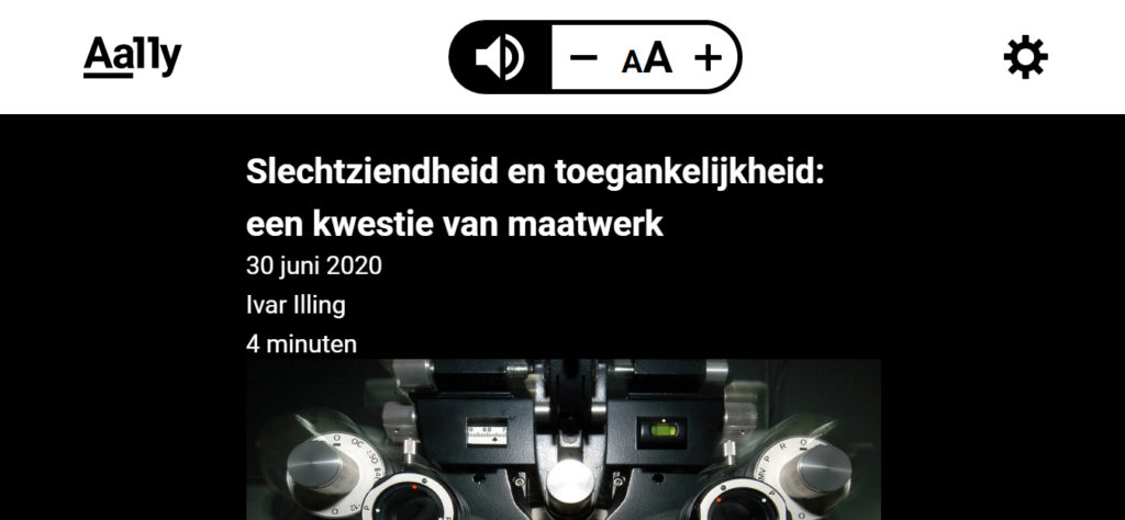
In contrast, there are people with photophobia, who can only tolerate very poor light and even experience it as painful. They will choose colors with a low brightness and therefore little contrast.
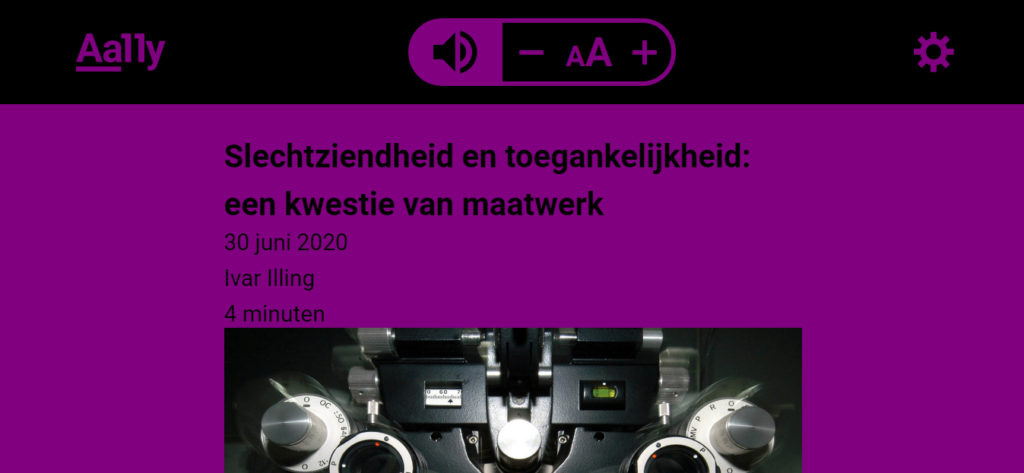
Many eye diseases lead to loss of vision. Typically, people have a 180-degree field of view from left to right and 150 degrees from top to bottom. Field of view failure can be central, to the periphery of your sight, or spots occur in your view.
People with field of view failure have trouble finding or retrieving information on a web page due to a lack of overview. It is more difficult for them to follow text lines and text columns and to navigate a website.
Color blindness comes in different degrees. It is very rare that no color is seen anymore. Color blindness is more common for men: 8% of men and only 0.5% of women are colorblind. Since a lot of information on web pages is communicated with color, offering custom color settings for this type of visual challenge can be of great value.

You see, every kind of visual challenge requires its own adjustments. Aally offers visually challenged people the tools they need to read and use a website. They decide on how they want the content of your web pages be presented, so that it suits their needs. For example, the user chooses the best fitting font, the correct font size and the perfect contrast. In addition, Aally provides more overview, which makes reading easier.
Curious about how Aally works? Request a demo without obligation. We would love to show you!
This is part 2 of our blog series about testing the accessibility of your website. Also read the other parts:
Color and contrast
Keyboard navigation
Automatic testing
Screen readers
Do you want to get started with the accessibility of your website? Then it helps to test how your website is now. You learn a lot from this, so that you can then take more targeted measures. This is part 2 of our blog series about testing the accessibility of your website. In this section, we will discuss increasing the font size on your website.
Many people with visual challenges cannot read the text on your website in the normal format. Even people with healthy eyes sometimes feel the need to enlarge text. For example, because fonts are too small or eyes are tired. Sometimes people use a magnifying glass, but more often they enlarge the text on the website itself. This can be done in many ways. For example with digital magnifying glasses in the browser or with magnification software. What happens to your website when someone enlarges the font?
Something is said about enlarging text in the WCAG. In success criterion 1.4.4 it says the following:
Except for captions and images of text, text can be resized without assistive technology up to 200 percent without loss of content or functionality.
It is important that no usability issues arise when enlarging the font. Sometimes scaling text will be cut off, overlap with other content, or displayed too much vertically (for example, because only 1 word fits on a line).
According to the WCAG workgroup, users are better off zooming the entire page (not just the text) if they want to enlarge the font by more than 200%. The user may then have to scroll horizontally or vertically. When the font size is enlarged by more than 200%, the aforementioned usability problems arise earlier.
What happens to your website if you enlarge the font by 200% or if you zoom in on the page? Is the text still legible? Can you still easily find your way on your site? Is everything still functioning properly? There are a number of software packages available that allow you to enlarge the font. Examples are Magic, ZoomText or Supernova. However, these are quite expensive for these types of tests. A free zoom option is also offered within each operating system:
Enlarge font size and zoom in Windows: If you go to Settings in Windows and then Accessibility, you will find the option to enlarge text. You can also use the magnifying glass.
Enlarge font size and zoom in MAC OS: Apple devices also allow you to enlarge fonts by enabling Apple Zoom accessibility options in the MAC OS and zooming in on a web page.
At least check the following during testing the enlargement of your text:
In part 3 of this blog series, we are going to talk about using the keyboard while navigating your website.
This is part 3 of our blog series about testing the accessibility of your website. Also read the other parts:
Color and contrast
Enlarge font
Automatic testing
Screen readers
Do you want to get started with the accessibility of your website? Then it helps to test how your website is now. You learn a lot from this, so that you can then take more targeted measures. This is part 3 of our blog series about testing the accessibility of your website. In this section we discuss how to test whether your website is suitable for keyboard navigation.
If you want to make your website accessible, this is an essential part. Many people with motor challenges cannot use a mouse and depend on a keyboard for navigation. Blind and partially sighted people also often use a keyboard to navigate quickly. You can easily do this test manually.
The WCAG describes a few things about making your website accessible to a keyboard. In summary, this is what is necessary to make your website accessible to the keyboard according to guideline 2.1.1. from WCAG:
All functionality of your website must be operable via a keyboard interface. This also applies to forms, menus, buttons and ordering processes.
To be able to navigate on your website with a keyboard, it should not be necessary, for example, to press a key several times within a short time or to hold down a key for a longer time.
Sometimes it is not possible to make a functionality accessible by means of keyboard navigation. This applies to functionality that depends on the path of the user’s movement. Examples include freehand drawing and watercolor painting. These activities are not only about the start and end points, but also the path between them. Therefore, drawing a regular geometric shape or moving an object is possible with a keyboard, but creating a watercolor painting is not.
Before you start testing, it is useful to know how users usually navigate with a keyboard. Therefore a short explanation.
The main key for keyboard navigation is the TAB key. With this key you can navigate within a website between links and within forms. With SHIFT-TAB keys you go back. In addition, the ENTER key and the SPACE bar are often used to select items and to click. The ARROWS keys are used for other navigation in a website. At the bottom of this WebAIM article you will find an overview of commonly used key combinations.
Users generally navigate with the TAB key to links, buttons and items within forms. It is important that the user can see which element has the focus of the keyboard. Often this is done by means of a border, but you can also choose to make elements extra striking in other ways. For example, by changing the background color.
It is also important in which order interactive items are located on the page. The user usually expects this to happen from left to right and top to bottom.
Today, accessible websites often allow people to jump directly to the main content with their keyboard. Especially if there are many interactive elements above the main content.
Blind and partially sighted people depend on the description of the elements on your website. Links and buttons with “click here” ensure that these users have no idea what they are activating or where they are navigating.
Okay, we’re ready to test. First of all: turn off your mouse before starting the test. You want to see what happens if you only rely on keyboard navigation.
Then ask yourself the following questions:
Want to know more about testing the accessibility of your website? In part 4 of this blog series we will discuss automatic tests.